UI / UX Design
ENT Boumerdes — Exam Results, Model Answers & Grade Appeals
Description: A three-sided academic platform that replaced scattered, informal grade appeal processes — giving students transparent access to their results and model answers, teachers a structured way to manage their classes and respond to appeals, and university staff the oversight they needed to keep everything accountable.
Year :
2022 - 2023
Industry :
Education
Client :
University of Boumerdes - Faculty of Science
Project Duration :
4 months

Problem :
After exams, students had almost no reliable way to challenge a grade they believed was wrong. Some emailed their professor directly. Some showed up in person, hoping the teacher was actually there. Some filled out a Google Form that may or may not have reached anyone. Meanwhile, teachers had no unified place to publish results or model answers — it happened whenever, however, through whatever channel they preferred.
The result was chaos on both ends. Students didn't know if their appeal was received, let alone being reviewed. Teachers were fielding requests from multiple directions with no way to track what had been handled. And for university administrators, there was no visibility at all — if a teacher was consistently rejecting appeals at an unusual rate, or never publishing results on time, no one would know until a student complained loudly enough.

Solution :
A structured platform where the entire post-exam cycle — results, model answers, appeals — happens in one place, with full visibility for everyone involved.
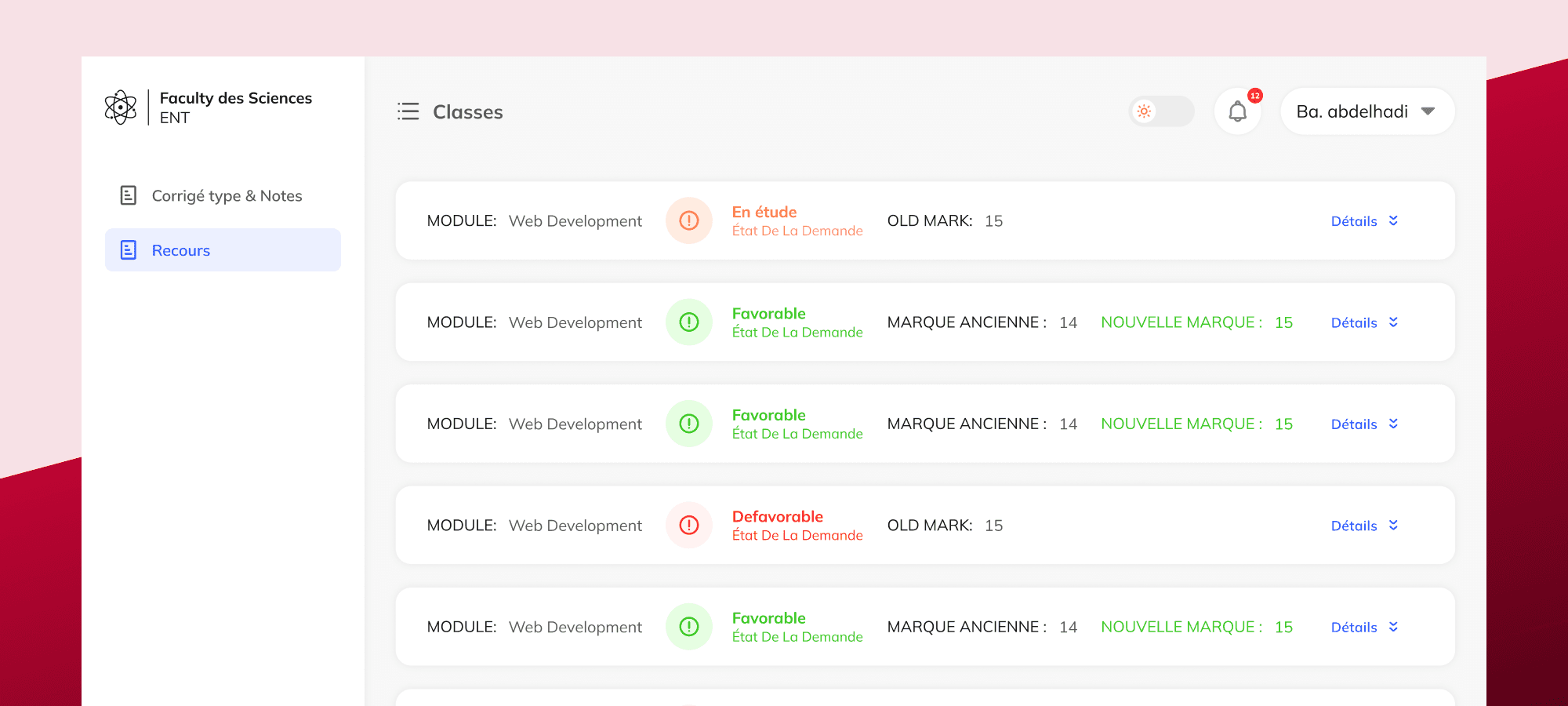
Teachers log in and see their classes. Each class has three tabs: upload the model answer, upload grades, and review incoming appeals. They set a time window for each — when the model answer becomes visible, when appeals open and close. Once the window opens, students can review their grade alongside the model answer and decide whether to appeal. If they do, they write their reason, attach a supporting document if they have one, and submit. The teacher receives it, reviews it, and responds with either a favorable or unfavorable decision — and a note explaining why. The student sees the outcome directly in the platform, including whether their grade was updated.
Above the teachers, department staff and faculty admins have dashboards that show everything — how many appeals came in across each module, what percentage were accepted or rejected, which modules have the highest contest rates, which teachers haven't published results yet. Not to intervene in individual decisions, but to have the data if something looks off.


Challenge :
The appeal flow sounds simple until you actually design it. The timing logic alone required careful thought — model answers need to be visible before appeals open, appeals need to close before results are finalized, and everything needs a clear deadline so students know exactly when the window shuts. Getting that sequence right in the UI, without it feeling like a bureaucratic obstacle course, took multiple iterations.
The bigger challenge was the accountability layer. The admin dashboards weren't just decoration — they were the entire reason the university trusted the system. A teacher who consistently rejects 90% of appeals, or one who never uploads results on time, now shows up in the data. That visibility had to feel natural and informative, not punitive. Designing dashboards that surfaced genuinely useful patterns — most contested modules, appeal rates by level, unfilled classes — without making it feel like surveillance required a lot of deliberate framing in the information hierarchy.
Summary :
ENT started as a workflow problem and turned into an accountability design problem. The core question wasn't just "how do students submit appeals?" — it was "how does the university know the process is being handled fairly?" The answer was visibility at every level: students see their status in real time, teachers see all their appeals in one place, and administrators have the data to notice when something's wrong before it becomes a complaint.
Two platforms built during the same internship, both solving institutional trust problems through structured, transparent design. That's probably where my instinct for dashboards, multi-role systems, and hierarchy-aware UX was first properly tested.
More Projects



UI / UX Design
ENT Boumerdes — Exam Results, Model Answers & Grade Appeals
Description: A three-sided academic platform that replaced scattered, informal grade appeal processes — giving students transparent access to their results and model answers, teachers a structured way to manage their classes and respond to appeals, and university staff the oversight they needed to keep everything accountable.
Year :
2022 - 2023
Industry :
Education
Client :
University of Boumerdes - Faculty of Science
Project Duration :
4 months
Problem :
After exams, students had almost no reliable way to challenge a grade they believed was wrong. Some emailed their professor directly. Some showed up in person, hoping the teacher was actually there. Some filled out a Google Form that may or may not have reached anyone. Meanwhile, teachers had no unified place to publish results or model answers — it happened whenever, however, through whatever channel they preferred.
The result was chaos on both ends. Students didn't know if their appeal was received, let alone being reviewed. Teachers were fielding requests from multiple directions with no way to track what had been handled. And for university administrators, there was no visibility at all — if a teacher was consistently rejecting appeals at an unusual rate, or never publishing results on time, no one would know until a student complained loudly enough.
Solution :
A structured platform where the entire post-exam cycle — results, model answers, appeals — happens in one place, with full visibility for everyone involved.
Teachers log in and see their classes. Each class has three tabs: upload the model answer, upload grades, and review incoming appeals. They set a time window for each — when the model answer becomes visible, when appeals open and close. Once the window opens, students can review their grade alongside the model answer and decide whether to appeal. If they do, they write their reason, attach a supporting document if they have one, and submit. The teacher receives it, reviews it, and responds with either a favorable or unfavorable decision — and a note explaining why. The student sees the outcome directly in the platform, including whether their grade was updated.
Above the teachers, department staff and faculty admins have dashboards that show everything — how many appeals came in across each module, what percentage were accepted or rejected, which modules have the highest contest rates, which teachers haven't published results yet. Not to intervene in individual decisions, but to have the data if something looks off.
Challenge :
The appeal flow sounds simple until you actually design it. The timing logic alone required careful thought — model answers need to be visible before appeals open, appeals need to close before results are finalized, and everything needs a clear deadline so students know exactly when the window shuts. Getting that sequence right in the UI, without it feeling like a bureaucratic obstacle course, took multiple iterations.
The bigger challenge was the accountability layer. The admin dashboards weren't just decoration — they were the entire reason the university trusted the system. A teacher who consistently rejects 90% of appeals, or one who never uploads results on time, now shows up in the data. That visibility had to feel natural and informative, not punitive. Designing dashboards that surfaced genuinely useful patterns — most contested modules, appeal rates by level, unfilled classes — without making it feel like surveillance required a lot of deliberate framing in the information hierarchy.
Summary :
ENT started as a workflow problem and turned into an accountability design problem. The core question wasn't just "how do students submit appeals?" — it was "how does the university know the process is being handled fairly?" The answer was visibility at every level: students see their status in real time, teachers see all their appeals in one place, and administrators have the data to notice when something's wrong before it becomes a complaint.
Two platforms built during the same internship, both solving institutional trust problems through structured, transparent design. That's probably where my instinct for dashboards, multi-role systems, and hierarchy-aware UX was first properly tested.
More Projects
UI / UX Design
ENT Boumerdes — Exam Results, Model Answers & Grade Appeals
Description: A three-sided academic platform that replaced scattered, informal grade appeal processes — giving students transparent access to their results and model answers, teachers a structured way to manage their classes and respond to appeals, and university staff the oversight they needed to keep everything accountable.
Year :
2022 - 2023
Industry :
Education
Client :
University of Boumerdes - Faculty of Science
Project Duration :
4 months
Problem :
After exams, students had almost no reliable way to challenge a grade they believed was wrong. Some emailed their professor directly. Some showed up in person, hoping the teacher was actually there. Some filled out a Google Form that may or may not have reached anyone. Meanwhile, teachers had no unified place to publish results or model answers — it happened whenever, however, through whatever channel they preferred.
The result was chaos on both ends. Students didn't know if their appeal was received, let alone being reviewed. Teachers were fielding requests from multiple directions with no way to track what had been handled. And for university administrators, there was no visibility at all — if a teacher was consistently rejecting appeals at an unusual rate, or never publishing results on time, no one would know until a student complained loudly enough.
Solution :
A structured platform where the entire post-exam cycle — results, model answers, appeals — happens in one place, with full visibility for everyone involved.
Teachers log in and see their classes. Each class has three tabs: upload the model answer, upload grades, and review incoming appeals. They set a time window for each — when the model answer becomes visible, when appeals open and close. Once the window opens, students can review their grade alongside the model answer and decide whether to appeal. If they do, they write their reason, attach a supporting document if they have one, and submit. The teacher receives it, reviews it, and responds with either a favorable or unfavorable decision — and a note explaining why. The student sees the outcome directly in the platform, including whether their grade was updated.
Above the teachers, department staff and faculty admins have dashboards that show everything — how many appeals came in across each module, what percentage were accepted or rejected, which modules have the highest contest rates, which teachers haven't published results yet. Not to intervene in individual decisions, but to have the data if something looks off.
Challenge :
The appeal flow sounds simple until you actually design it. The timing logic alone required careful thought — model answers need to be visible before appeals open, appeals need to close before results are finalized, and everything needs a clear deadline so students know exactly when the window shuts. Getting that sequence right in the UI, without it feeling like a bureaucratic obstacle course, took multiple iterations.
The bigger challenge was the accountability layer. The admin dashboards weren't just decoration — they were the entire reason the university trusted the system. A teacher who consistently rejects 90% of appeals, or one who never uploads results on time, now shows up in the data. That visibility had to feel natural and informative, not punitive. Designing dashboards that surfaced genuinely useful patterns — most contested modules, appeal rates by level, unfilled classes — without making it feel like surveillance required a lot of deliberate framing in the information hierarchy.
Summary :
ENT started as a workflow problem and turned into an accountability design problem. The core question wasn't just "how do students submit appeals?" — it was "how does the university know the process is being handled fairly?" The answer was visibility at every level: students see their status in real time, teachers see all their appeals in one place, and administrators have the data to notice when something's wrong before it becomes a complaint.
Two platforms built during the same internship, both solving institutional trust problems through structured, transparent design. That's probably where my instinct for dashboards, multi-role systems, and hierarchy-aware UX was first properly tested.