UI / UX Design
UBins Boumerdes— Digitizing Master's Registration for the University
Description: End-to-end UI/UX design for a dual-sided academic platform that replaced a broken, paper-based registration process — letting students apply for master's programs and academic leave remotely, while giving university staff a clean, transparent system they could actually trust.
Year :
2022
Industry :
Education
Client :
University of Boumerdes - Faculty of Science
Project Duration :
4 months

Problem :
Students at the University of Boumerdes had no real way to apply for a master's program without showing up in person — or hoping their emailed PDF didn't get buried in an inbox. Applications came in through physical submissions, emails, Google Forms, and everything in between. Some got lost. Some never arrived. And for students living hours away, dealing with illness, or simply unable to travel, the whole system quietly worked against them.
For staff, it wasn't much better. Applications arriving from five different directions, no unified view, no audit trail, and a strict 80/20 quota to enforce — 80% standard admissions, 20% competitive placement — with nothing but spreadsheets and goodwill keeping it together. The process wasn't just inefficient. It was unfair.
Solution :
A single platform. Four access levels. One source of truth.
Students sign up using their unique matricule, complete their profile, and submit either a master's registration application — with transcripts, cover letter, and supporting documents — or an academic leave request with a documented reason. From that point on, they can track exactly where their application stands. Accepted. Rejected. Still under review. No more guessing, no more follow-up emails to a department secretary.
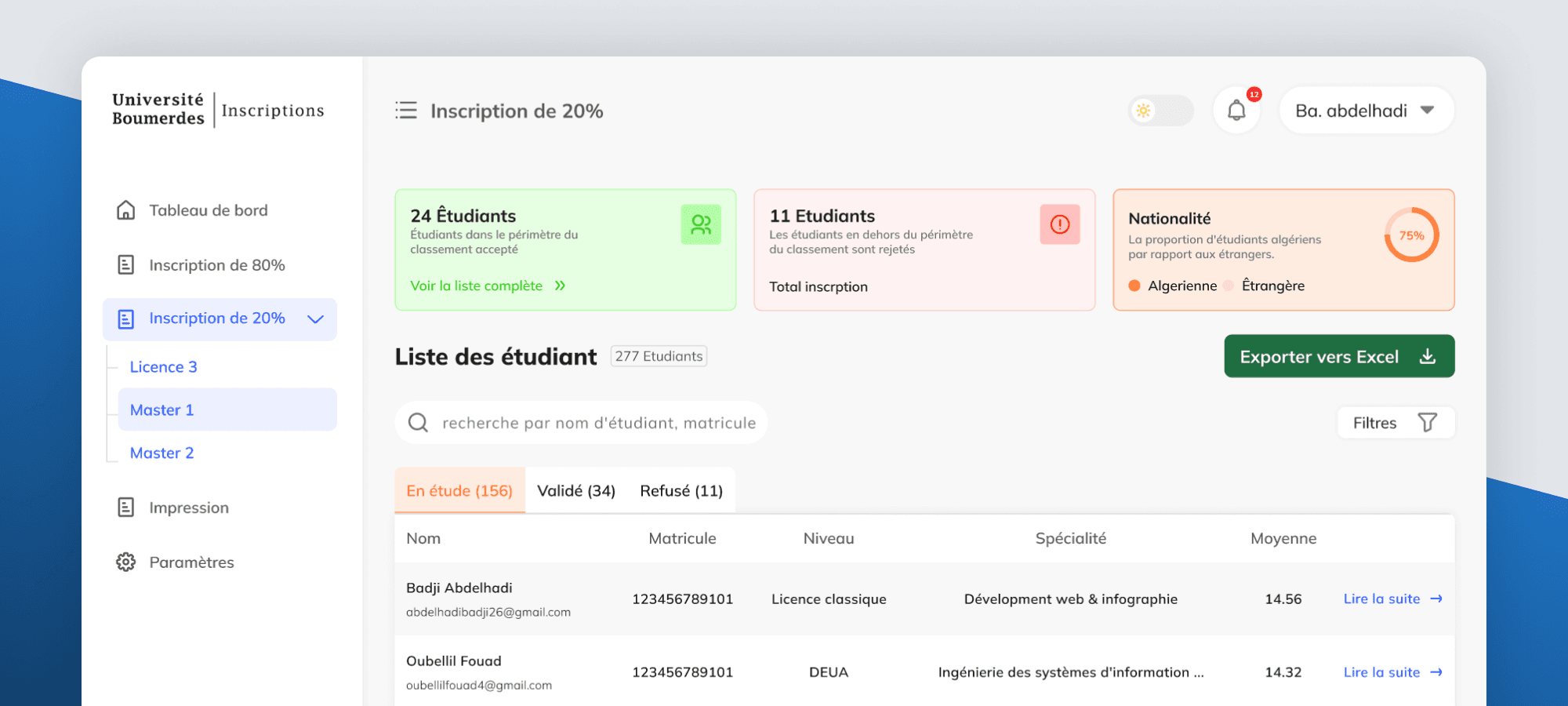
On the staff side, department reviewers only see students assigned to their department. They review full dossiers, apply the quota rules, and accept or reject — with every decision triggering a direct notification to the applicant. Faculty staff sit one level above, overseeing all departments within their faculty with the ability to step in and override. The Rectorat has full visibility across the institution and controls which faculties exist on the platform entirely. At the end of each cycle, the final accepted list can be exported and printed in multiple formats — ready for official use.


Challenge :
The obvious challenge was the four roles. A student tracking one application and a rectorat administrator overseeing an entire institution have almost nothing in common — and yet they're using the same product. Getting the permission logic right, keeping each role's experience focused without making it feel like four disconnected tools, required a lot of careful thinking about what each person actually needs to see and do at any given moment.
The less obvious challenge was trust. The whole reason this platform needed to exist was because the old system had eroded confidence — in both directions. Students didn't trust that their application would be handled fairly. Staff didn't trust that a digital system could match the control they felt with physical documents. Every design decision — the status indicators, the document upload confirmations, the accept/refuse flow, the quota-aware dashboards — was quietly answering the same question: can I rely on this?
Requirements came directly from meetings with the Vice Dean and Vice-Rector. Translating institutional language into actual UX decisions, with no prior system to reference, was its own design challenge on top of everything else.
Summary :
UBins looked like a form-builder problem on the surface. It wasn't. It was a trust problem — and a fairness problem — wrapped in bureaucratic complexity. By the time it shipped, students in remote cities could apply for a master's program from their phone. Staff had a single, auditable pipeline replacing five fragmented channels. And the quota system that previously relied on manual tracking had a structured, transparent workflow behind it.
Designing across four permission levels from scratch, within a real institutional environment, with direct accountability to senior university leadership — this is where a lot of my instincts around multi-role systems and complex workflows were first built.

More Projects



UI / UX Design
UBins Boumerdes— Digitizing Master's Registration for the University
Description: End-to-end UI/UX design for a dual-sided academic platform that replaced a broken, paper-based registration process — letting students apply for master's programs and academic leave remotely, while giving university staff a clean, transparent system they could actually trust.
Year :
2022
Industry :
Education
Client :
University of Boumerdes - Faculty of Science
Project Duration :
4 months
Problem :
Students at the University of Boumerdes had no real way to apply for a master's program without showing up in person — or hoping their emailed PDF didn't get buried in an inbox. Applications came in through physical submissions, emails, Google Forms, and everything in between. Some got lost. Some never arrived. And for students living hours away, dealing with illness, or simply unable to travel, the whole system quietly worked against them.
For staff, it wasn't much better. Applications arriving from five different directions, no unified view, no audit trail, and a strict 80/20 quota to enforce — 80% standard admissions, 20% competitive placement — with nothing but spreadsheets and goodwill keeping it together. The process wasn't just inefficient. It was unfair.
Solution :
A single platform. Four access levels. One source of truth.
Students sign up using their unique matricule, complete their profile, and submit either a master's registration application — with transcripts, cover letter, and supporting documents — or an academic leave request with a documented reason. From that point on, they can track exactly where their application stands. Accepted. Rejected. Still under review. No more guessing, no more follow-up emails to a department secretary.
On the staff side, department reviewers only see students assigned to their department. They review full dossiers, apply the quota rules, and accept or reject — with every decision triggering a direct notification to the applicant. Faculty staff sit one level above, overseeing all departments within their faculty with the ability to step in and override. The Rectorat has full visibility across the institution and controls which faculties exist on the platform entirely. At the end of each cycle, the final accepted list can be exported and printed in multiple formats — ready for official use.
Challenge :
The obvious challenge was the four roles. A student tracking one application and a rectorat administrator overseeing an entire institution have almost nothing in common — and yet they're using the same product. Getting the permission logic right, keeping each role's experience focused without making it feel like four disconnected tools, required a lot of careful thinking about what each person actually needs to see and do at any given moment.
The less obvious challenge was trust. The whole reason this platform needed to exist was because the old system had eroded confidence — in both directions. Students didn't trust that their application would be handled fairly. Staff didn't trust that a digital system could match the control they felt with physical documents. Every design decision — the status indicators, the document upload confirmations, the accept/refuse flow, the quota-aware dashboards — was quietly answering the same question: can I rely on this?
Requirements came directly from meetings with the Vice Dean and Vice-Rector. Translating institutional language into actual UX decisions, with no prior system to reference, was its own design challenge on top of everything else.
Summary :
UBins looked like a form-builder problem on the surface. It wasn't. It was a trust problem — and a fairness problem — wrapped in bureaucratic complexity. By the time it shipped, students in remote cities could apply for a master's program from their phone. Staff had a single, auditable pipeline replacing five fragmented channels. And the quota system that previously relied on manual tracking had a structured, transparent workflow behind it.
Designing across four permission levels from scratch, within a real institutional environment, with direct accountability to senior university leadership — this is where a lot of my instincts around multi-role systems and complex workflows were first built.
More Projects
UI / UX Design
UBins Boumerdes— Digitizing Master's Registration for the University
Description: End-to-end UI/UX design for a dual-sided academic platform that replaced a broken, paper-based registration process — letting students apply for master's programs and academic leave remotely, while giving university staff a clean, transparent system they could actually trust.
Year :
2022
Industry :
Education
Client :
University of Boumerdes - Faculty of Science
Project Duration :
4 months
Problem :
Students at the University of Boumerdes had no real way to apply for a master's program without showing up in person — or hoping their emailed PDF didn't get buried in an inbox. Applications came in through physical submissions, emails, Google Forms, and everything in between. Some got lost. Some never arrived. And for students living hours away, dealing with illness, or simply unable to travel, the whole system quietly worked against them.
For staff, it wasn't much better. Applications arriving from five different directions, no unified view, no audit trail, and a strict 80/20 quota to enforce — 80% standard admissions, 20% competitive placement — with nothing but spreadsheets and goodwill keeping it together. The process wasn't just inefficient. It was unfair.
Solution :
A single platform. Four access levels. One source of truth.
Students sign up using their unique matricule, complete their profile, and submit either a master's registration application — with transcripts, cover letter, and supporting documents — or an academic leave request with a documented reason. From that point on, they can track exactly where their application stands. Accepted. Rejected. Still under review. No more guessing, no more follow-up emails to a department secretary.
On the staff side, department reviewers only see students assigned to their department. They review full dossiers, apply the quota rules, and accept or reject — with every decision triggering a direct notification to the applicant. Faculty staff sit one level above, overseeing all departments within their faculty with the ability to step in and override. The Rectorat has full visibility across the institution and controls which faculties exist on the platform entirely. At the end of each cycle, the final accepted list can be exported and printed in multiple formats — ready for official use.
Challenge :
The obvious challenge was the four roles. A student tracking one application and a rectorat administrator overseeing an entire institution have almost nothing in common — and yet they're using the same product. Getting the permission logic right, keeping each role's experience focused without making it feel like four disconnected tools, required a lot of careful thinking about what each person actually needs to see and do at any given moment.
The less obvious challenge was trust. The whole reason this platform needed to exist was because the old system had eroded confidence — in both directions. Students didn't trust that their application would be handled fairly. Staff didn't trust that a digital system could match the control they felt with physical documents. Every design decision — the status indicators, the document upload confirmations, the accept/refuse flow, the quota-aware dashboards — was quietly answering the same question: can I rely on this?
Requirements came directly from meetings with the Vice Dean and Vice-Rector. Translating institutional language into actual UX decisions, with no prior system to reference, was its own design challenge on top of everything else.
Summary :
UBins looked like a form-builder problem on the surface. It wasn't. It was a trust problem — and a fairness problem — wrapped in bureaucratic complexity. By the time it shipped, students in remote cities could apply for a master's program from their phone. Staff had a single, auditable pipeline replacing five fragmented channels. And the quota system that previously relied on manual tracking had a structured, transparent workflow behind it.
Designing across four permission levels from scratch, within a real institutional environment, with direct accountability to senior university leadership — this is where a lot of my instincts around multi-role systems and complex workflows were first built.